Challenges
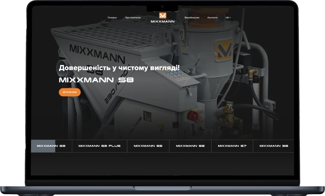
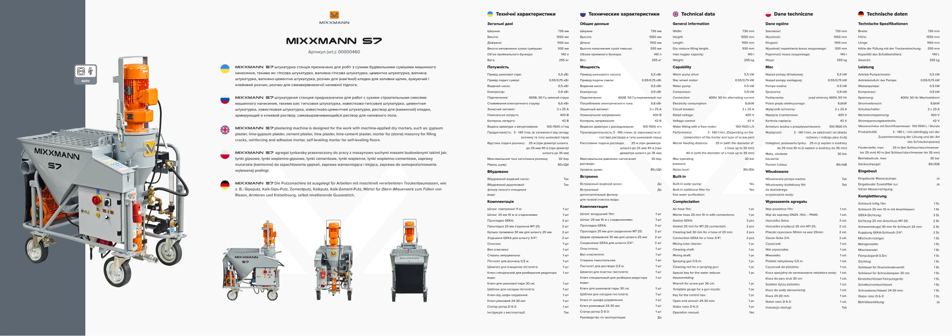
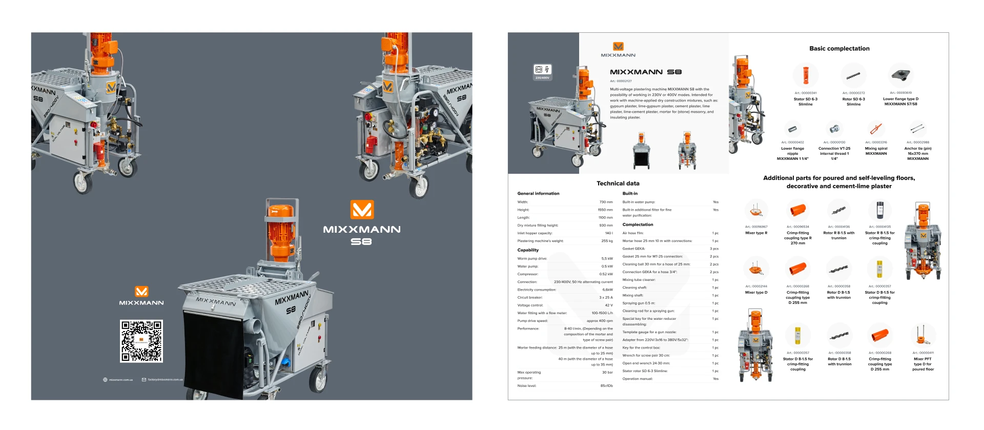
As part of the project, I was assigned to develop a complete brand identity package for "MIXXMANN", including a brand book, catalogs, flyers and website design. My work included the following tasks: Brand book: Developed the brand concept, including the definition of the color palette, typography, logo and its variations. Described the style of using the brand in various materials. Catalogs and flyers: I created the design of catalogs and flyers, where each material had to reflect the high technological and innovative nature of "MIXXMANN" products. The placement of text and images has been organized to attract attention and communicate information effectively. Website Design: Created a website with an appropriate design, taking into account the key meaningful elements of the brand. The placement of information, the use of graphic effects and animations gave the site a dynamic and professional look. This project made it possible to ensure the unity of the brand on all platforms, create an excellent visual identity and emphasize the excellence of "MIXXMANN" products in all materials - from paper catalogs to a digital website.
Sollutions
During the development of the project for MIXXMANN, several key decisions were made that helped to achieve the goal of transferring the company's excellence and technology: Innovative design: The visual style has been created to convey the innovative character of "MIXXMANN" products. The use of modern forms and graphic elements emphasized the technological dimension of the product. Responsive design: Different screen sizes are taken into account, ensuring the adaptability of the design on different devices - from computers to smartphones. Convenient navigation: Well-thought-out navigation helps users quickly find the information they need. Clear sections and directions make it easy to interact with the site. Informative content: Effective use of text, images, and graphics helps clearly communicate key product benefits and functionality. Brand usage: According to the established brand book, the entire design reflects the corporate identity of "MIXXMANN", reinforcing the brand unity. Effectiveness of fonts and colors: The optimal choice of fonts and colors helped create a readable and attractive design that maintained its structure on all platforms. These decisions made it possible to raise the perception of the "MIXXMANN" brand to a new level, creating an impression of professionalism and excellence in the eyes of customers.
Desing
The project development process for "MIXXMANN" was holistic and perfectly organized: Brand development: Analysis: In-depth analysis of competitors, target audience and features of "MIXXMANN" products. Definition of values: Defined the main values of the company, which were to be displayed in a visual form. Creation of the logo: We developed a unique logo that symbolized the innovativeness and technology of "MIXXMANN". Definition of stylistics: We chose a color palette and fonts that corresponded to the ideas of the brand. Brand book: We created a document that described the rules for using the logo, colors, typography and other important elements. Design of catalogs and flyers: Structure and content: The structure of catalogs was developed, the sequence of presentation of information about products was determined. Visual style: We created the design of catalogs and flyers, where the visual style reflected the cutting edge and technology of the products. Images and Illustrations: Highlighted products through quality images that showcased details and benefits. Website design: Site architecture: We developed the structure of the site, paying attention to convenient navigation and logical placement of information. Visual design: We created a design that integrated elements of the "MIXXMANN" brand. We focused on the purity and modernity of the design. Responsiveness: Responsive design was taken into account for convenient display on different devices. Interactivity: Added animations and effects that emphasized the importance of the technological component of the brand. This comprehensive approach helped create a uniform and recognizable image of "MIXXMANN" in various media, emphasizing the excellence and quality of their products.


Technologies
PHP
Laravel
HTML
CSS
JavaScript
jQuery
Development
In the "MIXXMANN" project, I played a key role in the creation of the brand book, catalogs, flyers and website design. Effectively conveyed the uniqueness and excellence of the company's products. My decisions helped to achieve the following goals: Identity design: I took into account the features of the "MIXXMANN" products and created a design that reflected its advanced technological character. Clearly expressed innovativeness in visual elements. Clear Information: Placed key product benefits and features on the home page for vulnerable customer receptivity. Developed informative blocks that conveyed the uniqueness of the stations. Responsive Design: Made the site responsive across multiple devices so customers could access information from any mobile device. Support of visual identity: Using corporate colors and design elements, ensured unity of visual style with other company materials. Easy navigation: Emphasized ease of navigation with clear menus and structured blocks. The web site was developed with the help of technologies: HTML, CSS, JavaScript, PHP, Laravel, MySQL.
Result
https://mixxmann.com.ua/
